Summary
- Python allows free creation of plots, unlike expensive, stagnant graphing calculators.
- Import NumPy and Matplotlib for basic linear and polynomial plots in Python.
- Seaborn lets you make statistical plots, like bar charts, histograms, and regression, with Python for free.
Graphing calculators are handy in math and science courses, but they’re expensive for a category that has changed very little since their introduction in 1985. Python lets you make plots of common equations and statistical graphs for free with the right libraries.
Basic Plots With NumPy and Matplotlib
It’s easy to create basic linear and polynomial plots with Python. One advantage is that they’ll be in contrast to basic calculators only offering monochrome screens, compared to the way graphing calculators have stagnated, something that xkcd has pointed out. The best way to do this is by either running Python in the terminal or a Jupyter notebook. If you’re using the terminal, I recommend using IPython, as it has a lot of features to make interactive use easier and it’s the basis for using Python in Jupyter.

Related
How to Get Started Creating Interactive Notebooks in Jupyter
Freely mix text and code in your programs in a new style of programming.
To import NumPy into your Python session or script, just use this command:
import numpy as np
Shortening the command will make it easier to type.
You also need to import the Matplotlib plotting library. This is also easy to do:
import matplotlib.pyplot as plt
If you’re working in a Jupyter notebook, any plots you make will appear in a separate window rather than in the notebook. You might want to change this to inline display with a “magic command”:
%matplotlib inline
With those preliminaries out of the way, we can define our equations to plot.
To plot a linear equation, remember that the slope-intercept form is y = mx + b, where “m” is the slope, or steepness, of the line and “b” is the y-intercept, where it crosses the y-axis, or the vertical axis on a 2D plane.
We’ll set up our x-axis with the np.linspace command, which will set up an evenly spaced array of values. This command will set up an x-axis of 50 datapoints between -10 and 10:
np.linspace(-10,10)
We’ll store the slope in a variable. We could put it directly in the formula, but using variables will allow us to change the values more easily. We’ll use the variable “m” for our slope, which will be 3.5:
m = 3.5
We’ll use “b” for our y-intercept:
b = 5
The y-axis will multiply each value of x by the slope and add the x intercept: y
y = m*x + b
Now we’ll make our plot:
        plt.plot(x,y)
plt.grid()
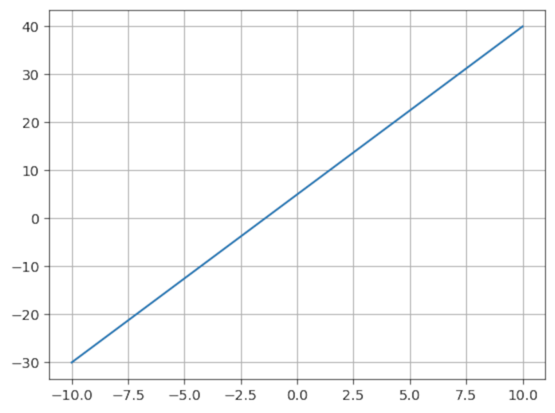
The plt.plot() command calls Matplotlib to plot the x and y values, and the plt.grid() command creates a grid behind the plot so we can see the axes more clearly.
You can plot a quadratic equation using a similar method. A classic quadratic equation is ax² + bx + c. We can set variables for a, b, and c as well as create an x-axis:
x = np.linspace(-10,10)
a = 1
b = 2
c = -3
y = a*x**2 + b*x + c
plt.plot(x,y)
plt.grid()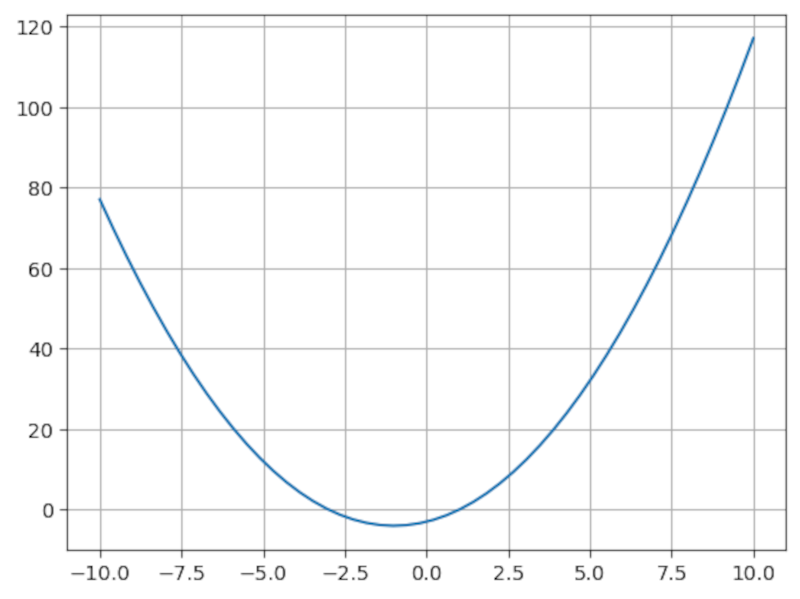
While in algebra multiplication is implied, such as “ax”, in Python, you have to explicitly define it. For example:
** is also the exponent operator in Python. So x² in Python is written as x**2.
Polynomials of higher degrees, such as cubic (cubed) and quartic (raised to the fourth power), work similarly.
Creating Plots Algebraically With Sympy
An alternative to using NumPy is SymPy, a computer algebra library for Python. SymPy operates on symbols the way a numeric calculator or regular Python program works on numbers. For graphing, NumPy offers a more concise way of defining equations, similar to how you’d work with them using pencil and paper.
You can install SymPy with pip:
pip install sympy
To work with SymPy, you have to import it and define symbolic variables. SymPy includes a script called isympy that you can run from the terminal that loads it in and defines some common variables like x and y for you, sets up pretty-printing, then starts an interactive session. You can also set it up in a Jupyter Notebook or regular interactive Python session:
        from sympy import *
x = symbols('x')
init_printing()
This tells Python to import SymPy into the main namespace, define a symbolic x variable, and set up “pretty printing.” This will make the output look more like it does in a math textbook. Symbolic variables have to be defined before you can use them with SymPy.
We can use regular variables for the coefficients as we did with NumPy. Let’s plot the linear equation from earlier using SymPy:
        m = 3.5
b = 5
plot(m*x + b,(x,-10,10))
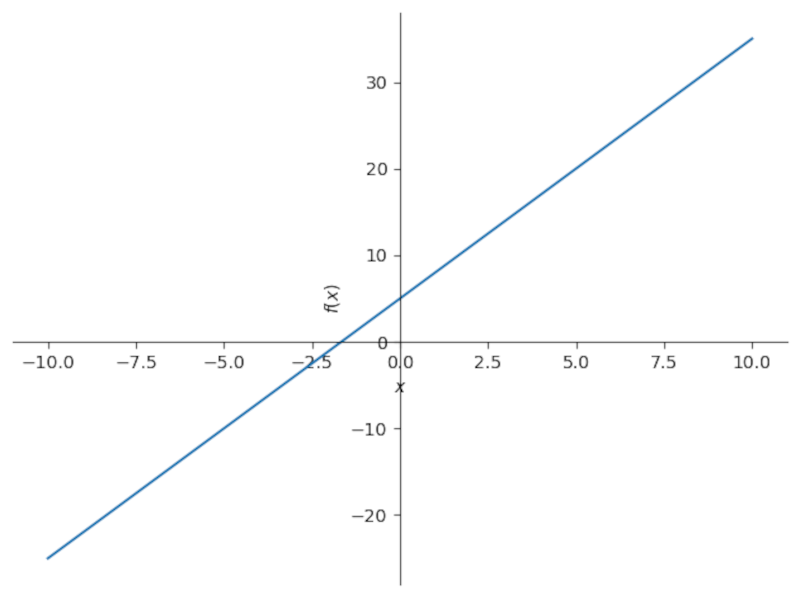
The plot function creates a 2D plot with the slope-intercept form of the equation, and the (x,-10,10) part specifies the range of the graph, between the x values of -10 and 10. This will also be the default range if you omit that section. Notice that the axes are right in the graph.
Remember to close all parentheses. IPython and Jupyter will help you by highlighting parentheses when you type them.
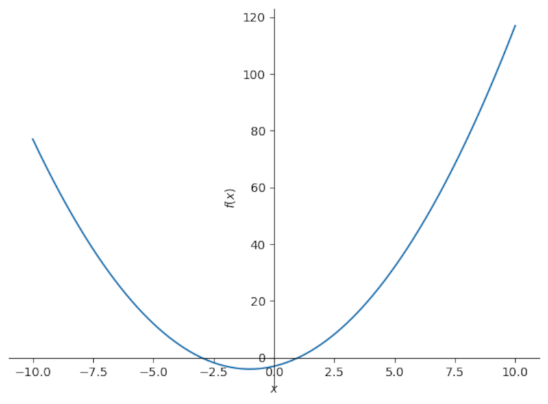
Quadratics and other polynomials work the same way:
        a = 1
b = 2
c = -3
plot(a*x**2 + b*x + c,(x,-10,10))
Making Statistical Plots
In addition to plotting lines and curves, Python can be used to make statistical plots. Sure, you could do this in a spreadsheet like Excel, LibreOffice Calc, or Google Sheets, but I find the output looks nicer this way than using a spreadsheet.
In this section, we’ll use the Seaborn library, which I’ve covered previously, to visualize statistical data with Python the way you would with a graphing calculator in a stats class.

Related
How I Explore and Visualize Data With Python and Seaborn
Making plots is easier and better-looking than you think with Seaborn.
You can install it with pip:
pip install seabornLet’s import Seaborn into our IPython session or Jupyter notebook.
import seaborn as snsAs with NumPy earlier, importing this way will save on typing.
Seaborn has several datasets included to play with. We’ll use a dataset of tips in New York restaurants:
tips = sns.load_dataset('tips')We can see the columns of our dataset, which is in the format of a Pandas dataframe, similar to a spreadsheet, using the head() function:
tips.head()
You can even import your own spreadsheet data from Excel or another program.\ For example, to read a CSV file:
        import pandas as pd
data = pd.read_csv("/path/to/data.csv")
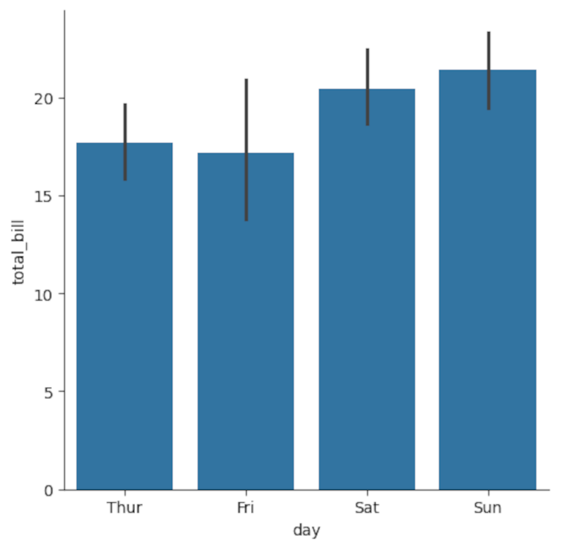
With the data loaded in, we can start looking at it. To see a simple bar chart of the total bill during the days of the week, use the catplot function:
sns.catplot(x='day',y='total_bill',kind='bar',data=tips)
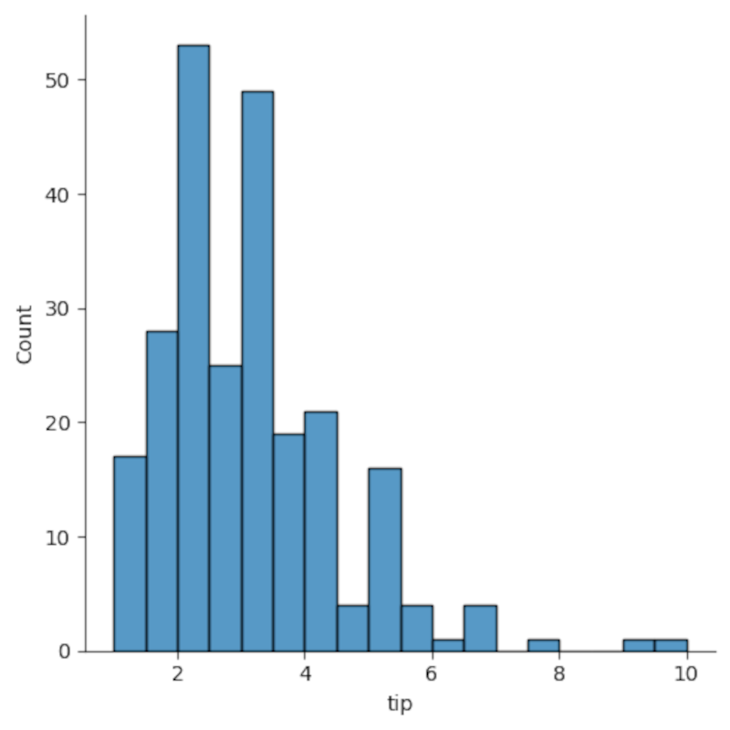
Another useful plot is a histogram, which shows the distribution of the data. To see the most frequent amounts for tips, use the displot function:
sns.displot(x='tip',data=tips)
A boxplot, or more properly a box-and-whisker plot, will help you visualize the range of your data. Let’s look at the total bill again, but modify the kind from a bar chart to a boxplot:
sns.catplot(x='day',y='total_bill',kind='box',data=tips)
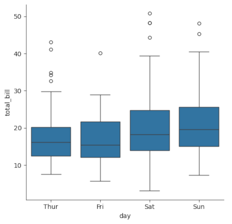
The boxes show the middle 50%, or median, of each category, represented by the line in the middle, while the lines at the top and bottom, the “whiskers,” represent the maximum and minimum values.
A powerful way of looking at data is through scatterplots and regression. A scatterplot looks at an independent variable on the x-axis vs a dependent variable on the y-axis to see if there’s a relationship.
Let’s look at how restaurant tips are related to the total bill.
sns.relplot(x='total_bill',y='tip',data=tips)
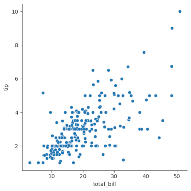
Notice how the values seem to align along a straight line? We can visualize this with a regression line using the regplot function. It’s essentially “relplot” changed by a single letter:
sns.regplot(x='total_bill',y='tip',data=tips)
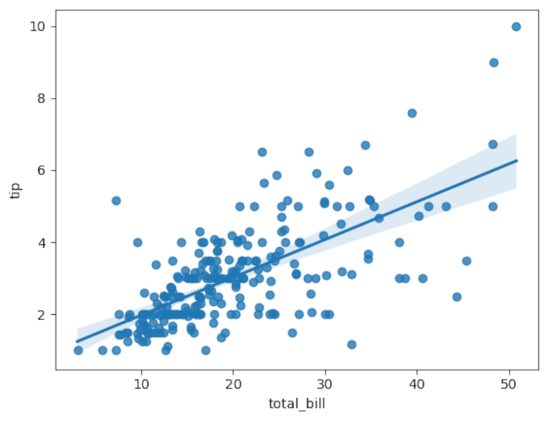
You’ll see the line superimposed on the original scatterplot. You can do more formal regression analysis to determine how much of a correlation there is, but it seems to be a good fit already by examining the line compared to the data points.
While you may still need to hang on to your graphing calculator for exams, when you’re doing your homework, exploring data, or even just messing around, Python plots look better and are also free. You don’t have to be a math nerd to appreciate that value.
.jpg?ssl=1)


.jpg?w=300&resize=300,300&ssl=1)

