
Quick Links
- What Does Each Map Color Mean?
- Roads, Railways, and Underground Tunnels
Google Maps is great for getting around—not only because of its simplicity, but also its color-coded topography that helps you discern forests from roads. Unfortunately, Google Maps doesn’t outright explain what each color means, so let me be your map key.
What Does Each Map Color Mean?
Google Maps is packed with useful features, from navigation functionality to improved safety tools. Google is always looking to improve the user experience, including thoughtful color coding designed to help you discern what you’re looking at instantly. The idea is to create a detailed representation of the world with a minimalist aesthetic.
Let’s start with the basic categories of colors and go from there.
Roads, Railways, and Underground Tunnels
Gray: This represents roads, highways, railways, and underground tunnels. Roads are a lighter gray, while highways are much darker with dotted white lines. These are notably easier to discern compared to the nearly identical shades of yellow Google Maps used before.
Railroads are thin gray lines, similar in color to roads. But they have one major distinction: dashes that are meant to resemble cross-ties. Underground tunnels are gray with cross-hatch shading.

Green Lines: When you enable the Biking option, you’ll find a series of green lines that refer to trails, bicycle-friendly roads, dedicated lanes, and dirt trails. These are represented as a solid dark green line, a dotted green line, a solid light green line, and dark green dashes, respectively.

Buildings
Light Gray: This color represents non-commercial areas—some hospitals, healthcare centers, residential homes, and even retirement homes.
If you zoom in, you’ll see minor distinctions between buildings. Residential buildings will be dark gray with a white background. The dark gray color is also used to symbolize unique sites, such as airports, industrial areas, and larger university campuses. In the example below, Denmark’s Copenhagen Airport is highlighted in dark gray.

An important note: while universities appear as dark gray on maps, if you zoom in enough to see all the different buildings in the institution, some will be tan and some gray. Military bases will also be identified in gray.
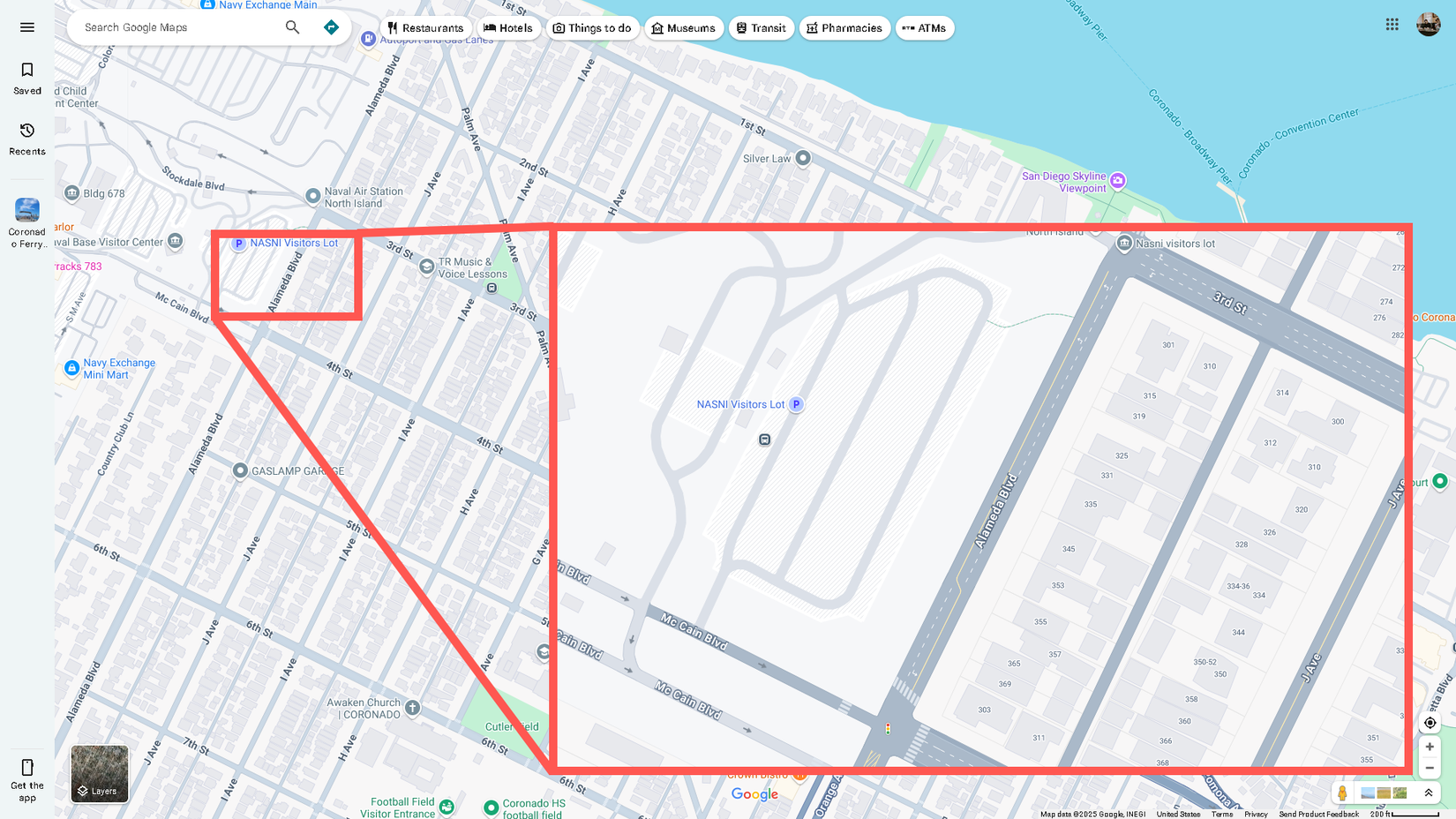
In the example below, you can see the separation between the US Naval Base in San Diego and the civilian residential area to the right. This is only different if you’re looking from far away; if you zoom in, both areas look the same, except for the roads. Roads in military bases will be gray, too.
Light Tan: This color symbolizes commercial areas, commercial buildings, and some hospitals. After you load any city in the world in Google Maps, you’ll see the city divided into gray and tan colors. Tan areas represent the city’s commercial centers, as well as include the city’s downtown and historical old town locations.

If you download a map for offline viewing, all this data and color coding will remain as detailed as the live, online version.
Nature and Parks
Dark Tan: This color is used for public beaches.
Blue: This color means water and rivers. Big bodies of water, like lakes, are blobs of blue. Meanwhile, rivers can appear as thin blue lines.
Brown: Google Maps uses a lot of shades of brown; they can represent anything from a desert to a national park or a mountain range. Depending on the place, they will usually be labeled. Officially, Google Maps calls it a natural sand/shrub color.
Green: Any time you see patches of greenery, you’re looking at forests and recreational parks. National parks can show up as green, too, though that varies between parks.
The example below shows an area around Boulder City, Nevada, where you can see a collage of blue, green, brown, and tan representing Nevada’s natural features.

Traffic
With the traffic layer enabled in Google Maps, you can see typical and live traffic in the area indicated by a series of green, yellow, and red lines. The color you see will clue you in on how light or bad the traffic is.

Green: When you see this, the road has minimal traffic, so you shouldn’t expect any delays.
Yellow: Yellow roads mean you should expect a decent amount of traffic.
Red: There are two shades of red: normal and dark red. If your maps have the traffic layer enabled or you’ve selected Directions, red on the street means heavy traffic and could signify that an accident or construction is causing it. Dark red means very heavy traffic.
Blue: This color only appears when you’ve set a destination in Google Maps, indicating the most optimal path to take with traffic in mind.
While Google Maps has changed some colors here and there since its inception, most of the original palette is intact. If you haven’t used it in a while, the change from yellow to gray streets is the most significant difference you’ll notice. I hadn’t used Maps for a while, and this is what threw me off the most. They really look like miniature streets now—dotted white lines and all.

")


")
